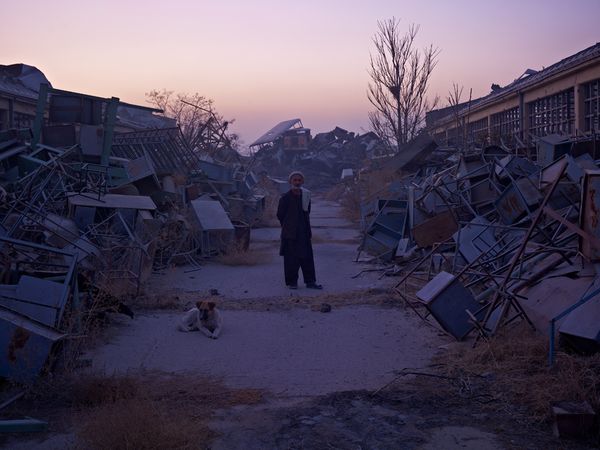
In my previous posts I stated that my work was to show how being homeless damages them on a personal level. Affecting their identity, isolation, mental and physical health.
After completing my shoot and images I’ve realised my work became more about the individual person i photographed.
Each film represented them, it was left in their area for a long period of time just like they would have been, it went through all of what that person would have had to endure. Being homeless does affect all the aspects listed above but I don’t want my images to further damage the issue of homelessness, or put it in a negative light, not all of them have mental problems or illness.
My images became more about the identity of these people, the films went through what they would have gone through, there was a danger that the rolls could have been moved, damaged or thrown away, this is what they have to worry about on a daily basis. Kurtis didn’t do his images to say that illegal immigrants were damaged people.
My images weren’t made to look at the negative issues that tag along with the homeless subject. I wanted to represent them individually.
I found it really interesting that these people have such a different way of living, they are isolated from our society but they have formed a underground one, they all know each other, help each other. Their daily goals are much different from ours, they are so caught up in living their lives day to day, trying to find shelter for the night etc, not being able to think long term to help them out of their situation.
Presentation
I have decided to go with the Japanese style book, I think that this design really strengthens my idea and makes the images more of a group rather than being separated by borders, it’s also a black smart book, not a scrap book which i think gives the right impression.
So the smallest I could print my medium format images was just a bit smaller than a A4 print which was way to big for my book.
Matt gave me the idea of doing a contact print of the images, so that they would be the same size as the negative frame. We tried it with my contact sheet and it looked good and i think it was a unique way to present my work.
I was worried that they would be too small, i felt like i was holding the image right up close to look at it properly but this was actually a good thing, peering at the image.
I printed my images at A4 size to see what it would look like, I was looking at the images from a distance, everything was visible without getting up close. With the smaller images it felt more intimate being closer to the prints, it created more of a personal relationship and interaction between the viewer and the subject. This of course worked really nicely with my idea, some people are afraid to get up close to homeless people.
When I was printing these in the darkroom, I saw a few people comment on how small they were but also they were getting closer to the prints squinting at them to see what it was of.
The size is similar to a passport photo which is ironic because most of these people don’t have any ID, again commenting on their identity. If you think about traveling with a passport the border police peer and squint at the image to see the image.
A problem I encountered with doing a contact print of each image was the black border around each image, I didn’t want the Instagram look to my images and i thought it would look much more professional and neater if they had a white border like most prints do.
I rectified this by moving the enlarger lens right down to about 3 inches away from the board, this narrowed the light and made the square of light just smaller than the neg frame.
Because i couldn’t focus the enlarger lens (was too close to the board) instead of having sharp lines around the light it had a very soft edge. At first i thought that this wouldn’t do at all, when i took it out and showed a few people they said it added to “not perfect” look I wanted and complemented the light leaks.
I knew i wanted something that explained my process in the book, because this was probably the most important aspect to my images.
I thought about a short statement, but I thought this might have been too straightforward.
Matt suggested a grid reference or street name and how long the film was left out for.
I thought about the latitude and longitude and the hours the film was left out for. But I don’t want it to be too complex.
The street name would be more vague so that these peoples identity would be protected and then i think it would be important to include the amount of time the film was left out for.
Below is an example of what Seba Kurtis included on his website, he placed text amongst his image slideshow to give context. They explain why he has done the work and what his process was.


“Each roll of film represented each individual.
I shot the film, left it outside, unprotected in their place for days…
bared to the elements, just like my subjects.”
Above is the statement I will use to put my work into context, hopefully this will prompt the viewer to back through the book and they should understand the captions under each image.
I have paired some images together, like the brothers they are on opposite pages and 2 other people that I met because they were together.
The order of the images is roughly in the order that I met them, bar a few because i had to do some moving around to get the images I wanted together . I chose to go for the polaroid style shape with the prints, normal borders just didn’t look right. Each print varies in sizes but i thought this just added character to the images.
They’re not neat prints, I would have liked to have done some dodging and burning but I felt that would have been altering the image by getting rid of the faults.